Since I think this is a common challenge in most homes, I thought I'd share the process with you. As with so many things, a photo wall looks effortless, but actually requires a lot of thought and preparation to pull off elegantly. Here is my advice:

 Notice how cropping and adjusting the contrast is enough to make a big difference in this image.
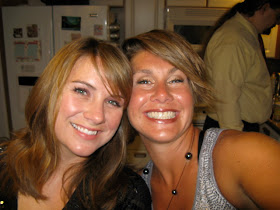
 I'm not a photo shop master by any means, but I thought this photo would look great if it were softened a bit. Eric suggested I google for a tutorial and this one was so easy to follow. I was thrilled with the result. One is a cute snapshot- the other two dewy goddesses! (Who wouldn't take advantage of a little computer trickery? All the supermodels do it!)

 I used the same effect here and also yellowed the photo to give it a vintage feeling. This is Honaunau, one of Kristin's favorite snorkel spots- and the site of my map from this project!
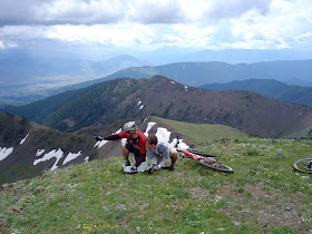
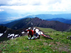
I feel like this looks like a scene from the Sound of Music in the "after" photograph. So lush and verdant! I hope I've convinced you to be more discerning in your photo displays and to try a little embellishing on the computer. It makes a huge difference. I will be sharing the final steps in the process- including before and after photos of her apartment soon. Stay tuned!
1) Be Choosy. Sort through your images and choose 10 or 11 absolute favorite all time shots. This can be difficult. Often times I have several versions of the same image and I like all of them. But put five shots from the same day on one wall, and you lose the visual impact. Instead of noticing the one great shot, they all become background noise. Be picky! You'll probably know in your gut which shot is the standout.
2) Now that you have these images, you are going to need to use Photo editing software to make them their absolute best. That's what this particular post is all about. I'm going to show you the difference between a cute snapshot and a gorgeous piece of art for your home.
3) Vary the SCALE. This is the number one mistake people make with photo display. They use regular old 4x6" photos in identical 4x6 photo frames- or worse- those precut mats with a zillion slots. This will not make your photos pop, feel special, or look like art. After you've photo shopped your images, upload them to Snapfish or Costco Photocenter. Make sure that you get a few 8x10's, at least one 11x14 and a scattering of 5x7 and 4x6. Keep the 2x3's for your vanity or bedside table- not the walls, unless they are in a larger mat.
4) Vary the Format. Make sure that all your photos aren't vertical or horizontal. You want a nice mix of both.
5) Vary the Presentation. Make sure that some of your frames have mats and some of them don't. Vary the size and look of the actual frame- not just the perimiter, but the frame itself. You want some big chunky ones and some elegant skinny ones. You can choose to mix and match wood, metal, black and white frames or stick to one color. I like the mismatched look because it feels like a collection that has built up over time instead of one that was purchased all on one day from a Pottery Barn Catalog.
Today I'd like to share the photo editing process with you. Kristin diligently chose 10 shots. Since she is celebrating her new life here in Hawaii, many of the shots were of favorite spots around the islands. The more personal the better- the idea is to tell your story and let yourself shine through.

 Notice how cropping and adjusting the contrast is enough to make a big difference in this image.
 I'm not a photo shop master by any means, but I thought this photo would look great if it were softened a bit. Eric suggested I google for a tutorial and this one was so easy to follow. I was thrilled with the result. One is a cute snapshot- the other two dewy goddesses! (Who wouldn't take advantage of a little computer trickery? All the supermodels do it!)
 I used the same effect here and also yellowed the photo to give it a vintage feeling. This is Honaunau, one of Kristin's favorite snorkel spots- and the site of my map from this project!

I feel like this looks like a scene from the Sound of Music in the "after" photograph. So lush and verdant! I hope I've convinced you to be more discerning in your photo displays and to try a little embellishing on the computer. It makes a huge difference. I will be sharing the final steps in the process- including before and after photos of her apartment soon. Stay tuned!

Becky you're amazing as always! Thanks for your inspiration. While hiking, I thought to vary the orientation & such. Let's see how they turn out! Many mahalos! I don't tell you enough how special you are to me!!
ReplyDelete